Static vs. Dynamic websites. What’s the difference? I should probably write a blog post on it. Here’s the short version from a user’s perspective:
A Static Website typically contains information that doesn’t change much—like a digital brochure. On the other hand, a Dynamic Website is built to contain one or multiple types of dynamic content— like blog posts, case studies, resources, FAQs, services, testimonials, events etc.
What is “dynamic” about those types of content, you ask?
Well, each one of these content types is usually built to render using a template so that it always follows the same structure. This allows for:
- Easy adding and editing in the website’s CMS.
- Consistent structure that’s clear and intuitive for visitors.
- Fast design tweaks—change the template once, and every relevant post, case study, or resource of that type updates automatically.
CristinaMuntean.com has all the dynamic content types listed above, so I’d classify it as a VERY dynamic website. It was fun to create. Here’s how it went:
A New Personal Website
In early 2024, I was asked by my long-term client, Cristina Muntean, to create a new version of her personal website—one that reflects all the progress she’s made since the last version.
You may notice that I didn’t include “Research & Planning” in the services provided for this case study. That’s because this project was a continuation of our long working relationship, during which I’ve built 5+ websites for her various projects and needs. All the fundamental research—market and industry insights, company background, keyword analysis—was already done. Our main task at the outset was to plan the project, particularly its UX, since this website is complex and dynamic (as mentioned above).
The entire project took about two months from start to finish. I should note that Cristina did all the copywriting herself (with some feedback from me). Normally, I’m not a fan of clients writing their own page or sales copy (more on that later); however, Cristina is, among other things, a published author who creates a lot of content for her sales and marketing. That made me perfectly comfortable letting her handle the writing for this site.
Website Redesign: It’s More Than Just UI Work
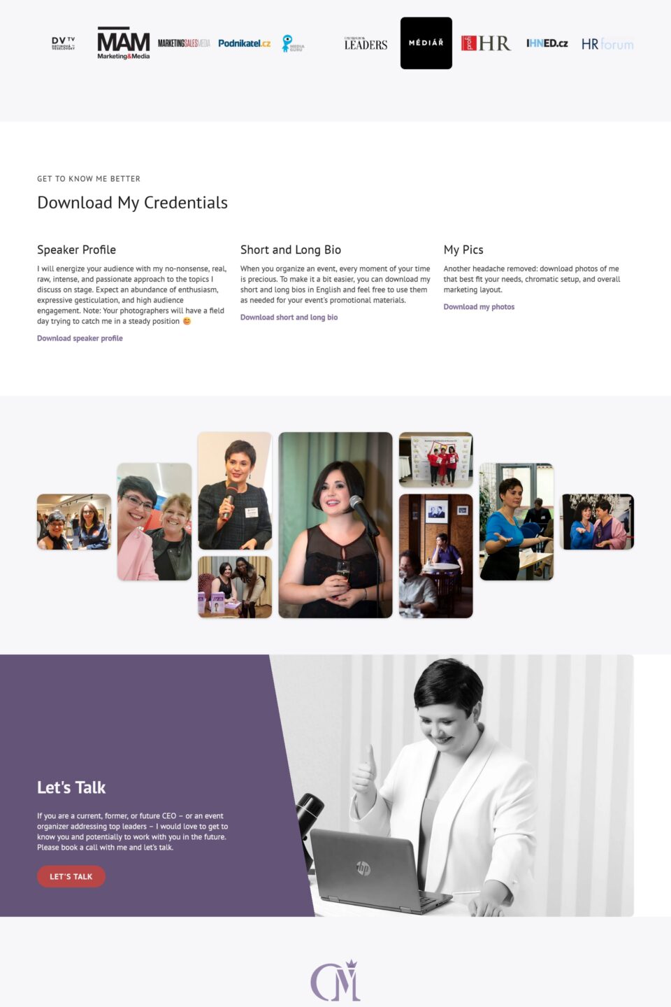
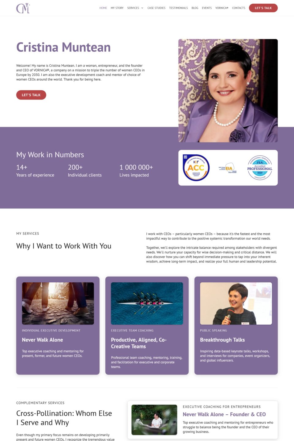
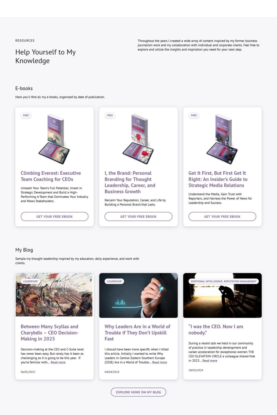
The biggest challenge with this website was the sheer amount of dynamic content. Take one look at the homepage, and you’ll see it’s a giant directory of content. The website has everything: articles, case studies, service FAQs, promotional ebooks with funnel automations, media galleries, testimonials, and more.
Because of that, UX was a real challenge: how do you design a site that accommodates so many content types yet remains easy to navigate for users—and easy to manage for the site admins?
UX and CMS Go Hand-in-Hand
You might think the CMS side of things—how to add, edit, or reorder content—can be left until the development phase. You might think that, but you would be wrong.
You will face some unpleasant surprises: the UX plan you pitched may not be viable or could make ongoing site management a nightmare. Sometimes it’s technically impossible to deliver certain features within your chosen CMS; other times it just takes so much effort that it undermines your initial UX vision.
Example: Lead Magnets
Let’s say the website should have lead magnets (like downloadable ebooks) to feature on the site. In the UX phase, you might design a single landing page for the one we have right now, along with a card layout linking to it. But that approach can create chaos later if you haven’t thought about how to scale or maintain additional lead magnets down the line.
Here are a few questions that must be considered in the UX phase, or better yet, planning phase, before you even start wireframing:
- How many lead magnets will the website feature? If there’s any chance of there being more than one, treat them as a dynamic content type. Create a template and, if necessary, categories or tags.
- What is the URL structure? Are you redesigning an existing site with established URLs? You may need to keep old URLs (if viable) or set up redirects.
- Where will these lead magnets appear? Are they linked in the navigation or page content, or “hidden” and accessed only via direct links?
- If the lead magnets are separate offerings, consider using a subdomain or separate domain.
- How should each lead magnet page be built? Can you create a reusable template with custom fields so team members can easily replicate it?
- Do we need documentation? A quick tutorial, checklist, or video might help the client add new lead magnets smoothly.
- What action do you want website users to take? If they fill out a form, where does the data go? Do they get a confirmation email? Do you integrate with a third-party marketing platform?
- If user data is stored or transferred elsewhere, double-check legal compliance and update any privacy documents as needed. Let the client know beforehand that they need to consult a lawyer.
- Are these lead magnets free or paid? If there’s a payment gateway involved, plan for it early. If they’re free, determine how you’ll track conversions.
By hashing out these details early, you can predict the final page layouts more accurately. That means smooth development with minimal rework.
Why It Matters
This lead magnet scenario is just one small example of many UX considerations we addressed before building cristinamuntean.com. In total, we probably faced 10–15 such decisions. It took extra work up front, but now the client can manage her site easily. She can grow and adapt her content without needing a complete overhaul every time.
So, it makes the site more sustainable. If we’d ignored scalability and maintainability, the site might’ve become unusable in a couple of years. By planning carefully, we’ve built a foundation that will serve both the client and her audience for a long time.
Why I Usually don’t let Clients Write Copy
Now, in the vast majority of cases, I don’t let my clients write their new website’s page or sales copy.
By “page copy,” I mean the text assets on main website pages, such as the home page or service pages. By “sales copy,” I mean text specifically designed to sell products or services. (Blog posts and other content are a bit different.)
Here’s why I don’t recommend it:
- The clients I work with usually aren’t website copywriters—or any kind of writers, for that matter.
- They often underestimate how long and difficult the process of writing good website copy can be.
- It almost always—about 90% of the time—causes project delays.
So, I usually hire copywriters or, in rare cases, write the copy myself.
For CristinaMuntean.com, however, I broke my own rule and let Cristina write her own copy (with some feedback from me). She’s a published author, has produced countless articles, and even worked as a journalist. Essentially, she has the skills—and finding a copywriter to replace her voice wouldn’t be practical.
I provided her with wireframes and a Google Sheets outline detailing what copy should go where. This kept her grounded in the right context while writing. In this case, the process went as smoothly as it does when I work with a dedicated copywriting specialist, so I’m glad we chose this approach.
New Branding and UI Mockups
The next stage of the project focused on user interface design—creating website mockups in Figma so the client could review (and ideally approve) the visual direction before development began. This approach saves time, minimizes misunderstandings, and keeps the project on schedule.
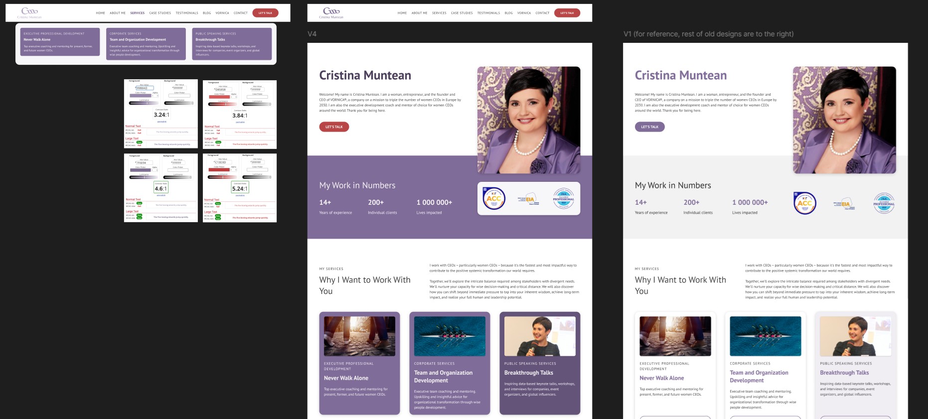
Image showing one small part of designing the home page mockup, specifically the decision around how to use brand colors and keep color contrast accessible. You can see I added color contrast checks as an argument against using too light of a shade of violet/red on a light background.
We also ended up using a new logo, thanks to the talented Pavla Rathouská—delivered on time, for which I’m incredibly grateful. When I work with brand designers, I often have to stand my ground on color contrast for accessibility and user experience, but Pavla and I were on the same page from the start, so there were no issues.
Putting it All Together
The web development—putting it all together and actually creating the website—was relatively smooth, all things considered.
When you spend the necessary time and effort in the previous project steps, the development is usually a breeze. It’s my favourite part of any project—I get to bring to life everything we’ve been working on for the past months, and the result is an actual thing that exists in public view. It’s really a rewarding experience.
The CristinaMuntean.com website development included:
- Setting up the server and domain
- Deploying my blueprint site and installing WordPress
- All dynamic data setup (posts, fields, taxonomies, etc.)
- Setting up media based on UI and media gathering
- Setting up styles: brand styles, contextual styles, element and component styles, etc.
- Creating and configuring forms (including integrations like lead magnet dynamic forms, contact forms, newsletter opt-in forms, etc.)
- Developing and designing templates (header, footer, legal page, testimonial, event, article, case study, thank you page, 404, etc.)
- Developing and designing pages (home, service pages, about, etc.)
- Content migration from the previous version of the website (blog posts, images, lead magnets, etc.)
- Integration with third-party tools (marketing, analytics, etc.)
- Testing everything
- Going through final client feedback and punch lists
- Creating documentation/tutorial for site admin work
- Launching the new website
All in all, the website was reasonably challenging to develop, and it took around three weeks from start to finish (development only, not including UX, copywriting, or UI).
What did I Learn?
The project was very challenging in that I had to constantly set constraints on design so that the sheer amount of different dynamic data types didn’t become overwhelming for site users and admins alike.
I also learned a lot about giving the copywriter everything they need to craft good page copy—including detailed discussions of the wireframes from a sales-copy perspective.
All in all, the project was very rewarding, and I’m very proud of the accomplishment as a whole.